Building charts and graphs are one of the best ways to visualize data in a clear and comprehensible way.
However, it's no surprise that some people get a little intimidated by the prospect of poking around in Microsoft Excel.
I thought I'd share a helpful video tutorial as well as some step-by-step instructions for anyone out there who cringes at the thought of organizing a spreadsheet full of data into a chart that actually, you know, means something.
But before diving in, we should go over the different types of charts you can create in the software.
Do you need to visualize Excel data in a graph or chart? If you’re working with a large data set, it’s a good idea to distill it into a graph that you can understand without needing to read individual numbers. It’s not necessary if you’re working with a small data set that’s easy to see and understand at a single glance.
That said, if you need to understand your data beyond raw numbers — such as make a comparison or see changes over time — you should use an Excel chart or graph. Here are a few potential use cases:
- Comparing data over time with a line graph
- Showing proportions and percentage ratios with a pie chart
- Comparing values with a column and bar graph
Types of Charts in Excel
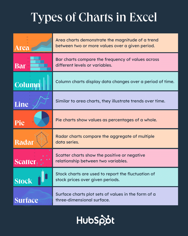
You can make more than just bar or line charts in Microsoft Excel, and when you understand the uses for each, you can draw more insightful information for your or your team’s projects. Here are some of your best options:
1. Area Chart
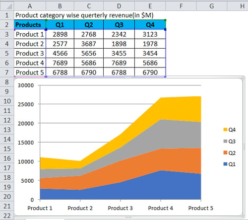
Area charts in Excel allow you to see trends over time or over another variable. It’s essentially a line graph, but with colored-in sections that emphasize progression and give a sense of volume.
You can also use stacked area charts. This type allows you to compare multiple categories’ trends and changes across different variables.
2. Bar Graph
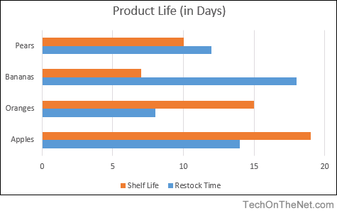
An Excel bar graph represents data horizontally, allowing you to compare different data sets and display trends over time. You can also see the proportions between two categories or data elements.
You can use a bar graph to compare the sales of different products, for instance, over months or quarters. This will allow you to understand which products you should push during one specific time frame.
3. Column Chart
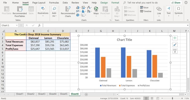
Column charts are similar to bar graphs, but they differ in one critical way: They’re vertical, not horizontal, and allow you to rank different data elements. For instance, if you want to rank the sales numbers for different states, you can visualize them in a column chart and see which states lead and which lag behind.
Like a bar graph, you can use a column chart to compare data, display trends, and see proportions.
4. Line Graph
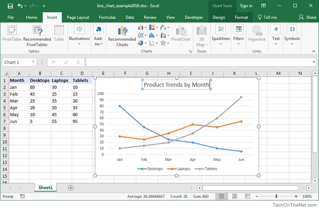
A line graph is an excellent way to see trends over time at a single glance without the frills of bars, columns, or extra shading. You can also compare multiple data series — for instance, the number of organic visits from Google versus Bing over a 12-month period.
You can also see the rate or speed at which the data set changes; a steep incline means you had a sudden spike in organic traffic, per our previous example, whereas a more gradual decline means that your traffic is slowly decreasing. Line graphs also allow you to pinpoint seasonal trends, such as spikes or drops due to holidays or weather.
5. Pie Chart
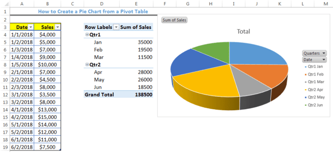
A pie chart is a helpful way of seeing how different data elements proportionally compare to one another. If you want to understand what percentage of your organic traffic is from Google versus Bing, or how much market share you have compared to competitors, then a pie chart is an excellent way to visualize that information.
It’s also an excellent way to see your progress toward a specific goal. For instance, if your goal is to sell a product every day for 30 days in a row, then you might create a pie chart that visualizes the number of days you’ve sold over the total of 30.
6. Radar Chart
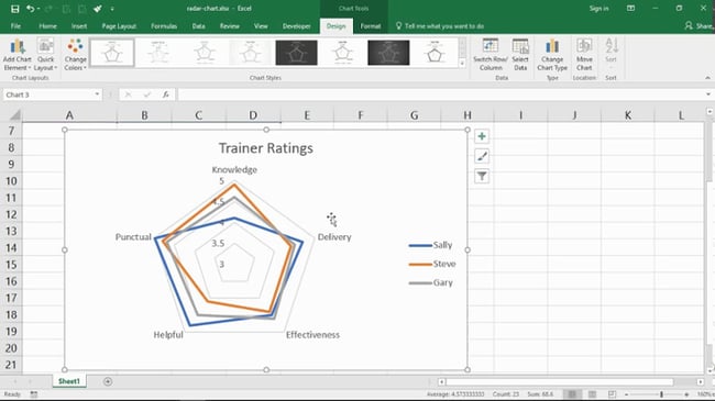
A radar chart might look familiar to you if you’ve ever taken a personality test, but it’s also useful outside of that arena. Radar charts display data in a closed multi-pointed shape, usually with multiple variables and data elements, while the size of the shape represents the total “value” of all the accounted variables.
This type of chart is excellent for comparing different data elements, such as attributes, entities, people, strengths, or weaknesses. It also helps you see the distribution of your data and understand if it's overly skewed to one side.
7. Scatter Plot
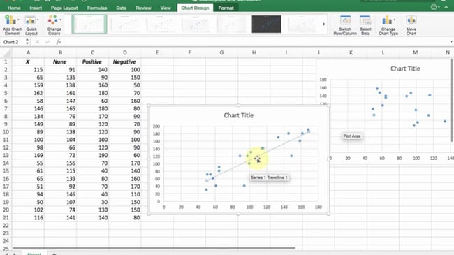
Scatter plots look similar to line graphs, except that it has one critical difference: It evaluates the relationship between two variables, shown respectively on the X- and Y-axes. You can therefore identify correlations and patterns. For instance, you might compare organic traffic with the number of leads and sign ups.
If you see an upward trend, then you’ll know that your efforts to increase organic traffic are effective. You can take it a step further and then compare the number of leads and signups with daily sales or conversions.
Other types of Excel charts include stock charts, which allow you to see changes in stock prices, and surface charts, which allow you to see data in a three-dimensional format.
Not sure which to use? We compare all of them below.
|
Type of Chart |
Use |
|
Area |
Area charts demonstrate the magnitude of a trend between two or more values over a given period. |
|
Bar |
Bar charts compare the frequency of values across different levels or variables. |
|
Column |
Column charts display data changes or a period of time. |
|
Line |
Similar to bar charts, they illustrate trends over time. |
|
Pie |
Pie charts show values as percentages of a whole. |
|
Radar |
Radar charts compare the aggregate of multiple data series. |
|
Scatter |
Scatter charts show the positive or negative relationship between two variables. |
|
Stock |
Stock charts are used to report the fluctuation of stock prices over given periods. |
|
Surface |
Surface charts plot sets of values in the form of a three-dimensional surface. |
The steps to build a chart or graph in Excel are relatively simple. I encourage you to follow the written instructions below (or download them as PDFs). Most of the buttons and functions you'll see and read are very similar across all versions of Excel.
Download Demo Data | Download Instructions (Mac) | Download Instructions (PC)
Featured Resource: Free Excel Graph Templates
Why start from scratch? Use these free Excel Graph Generators. just input your data and adjust as needed for a beautiful data visualization.
1. Enter your data into Excel.
First, you need to input your data into Excel. You might have exported the data from elsewhere, like a piece of marketing software or a survey tool. Or maybe you're inputting it manually.
In the example below, in Column A, I have a list of responses to the question, “Did inbound marketing demonstrate ROI?”, and in Columns B, C, and D, I have the responses to the question, “Does your company have a formal sales-marketing agreement?” For example, Column C, Row 2 illustrates that 49% of people with a service level agreement (SLA) also say that inbound marketing demonstrated ROI.

2. Choose from the graph and chart options.
In Excel, your options for charts and graphs include column (or bar) graphs, line graphs, pie graphs, scatter plots, and more. See how Excel identifies each one in the top navigation bar, as depicted below:

To find the chart and graph options, select Insert.
(For help figuring out which type of chart/graph is best for visualizing your data, check out our free ebook, How to Use Data Visualization to Win Over Your Audience.)
3. Highlight your data and insert your desired graph into the spreadsheet.
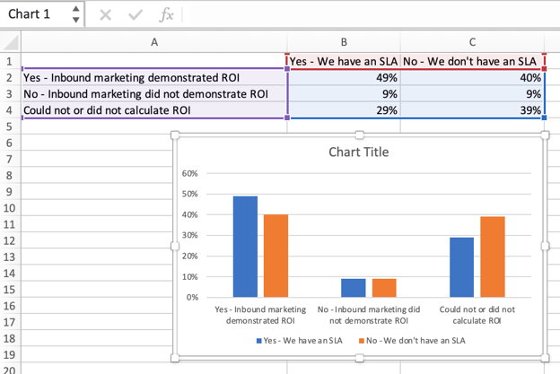
In this example, a bar graph presents the data visually. To make a bar graph, highlight the data and include the titles of the X and Y-axis. Then, go to the Insert tab and click the column icon in the charts section. Choose the graph you wish from the dropdown window that appears.
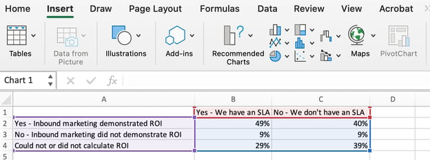
I picked the first two dimensional column option because I prefer the flat bar graphic over the three dimensional look. See the resulting bar graph below.
4. Switch the data on each axis, if necessary.
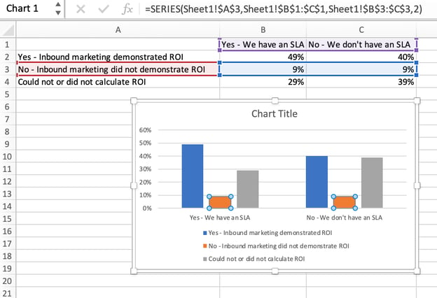
If you want to switch what appears on the X and Y axis, right-click on the bar graph, click Select Data, and click Switch Row/Column. This will rearrange which axes carry which pieces of data in the list shown below. When finished, click OK at the bottom.
The resulting graph would look like this:
5. Adjust your data's layout and colors.
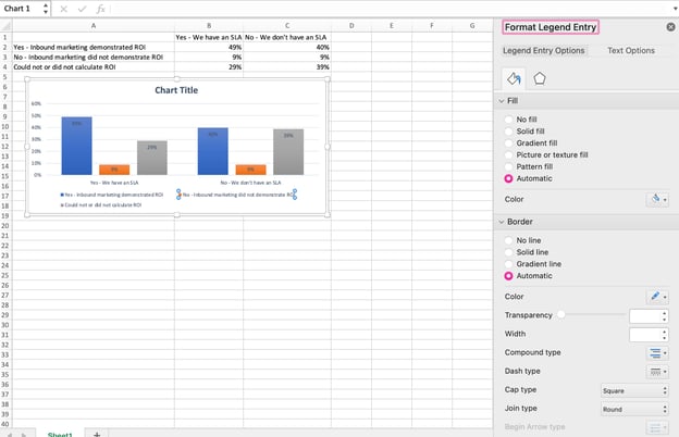
To change the labeling layout and legend, click on the bar graph, then click the Chart Design tab. Here, you can choose which layout you prefer for the chart title, axis titles, and legend. In my example below, I clicked on the option that displayed softer bar colors and legends below the chart.
To further format the legend, click on it to reveal the Format Legend Entry sidebar, as shown below. Here, you can change the fill color of the legend, which will change the color of the columns themselves. To format other parts of your chart, click on them individually to reveal a corresponding Format window.
6. Change the size of your chart's legend and axis labels.
When you first make a graph in Excel, the size of your axis and legend labels might be small, depending on the graph or chart you choose (bar, pie, line, etc.) Once you've created your chart, you'll want to beef up those labels so they're legible.
To increase the size of your graph's labels, click on them individually and, instead of revealing a new Format window, click back into the Home tab in the top navigation bar of Excel. Then, use the font type and size dropdown fields to expand or shrink your chart's legend and axis labels to your liking.
7. Change the Y-axis measurement options if desired.
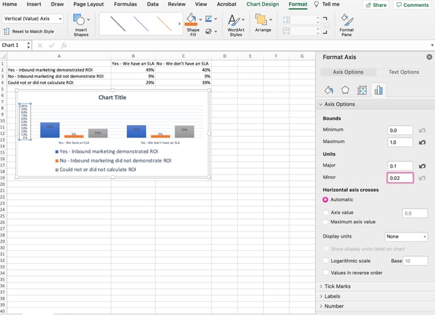
To change the type of measurement shown on the Y axis, click on the Y-axis percentages in your chart to reveal the Format Axis window. Here, you can decide if you want to display units located on the Axis Options tab, or if you want to change whether the Y-axis shows percentages to two decimal places or no decimal places.
Because my graph automatically sets the Y axis's maximum percentage to 60%, you might want to change it manually to 100% to represent my data on a universal scale. To do so, you can select the Maximum option — two fields down under Bounds in the Format Axis window — and change the value from 0.6 to one.
The resulting graph will look like the one below (In this example, the font size of the Y-axis has been increased via the Home tab so that you can see the difference):
8. Reorder your data, if desired.
To sort the data so the respondents' answers appear in reverse order, right-click on your graph and click Select Data to reveal the same options window you called up in Step 3 above. This time, arrow up and down to reverse the order of your data on the chart.
If you have more than two lines of data to adjust, you can also rearrange them in ascending or descending order. To do this, highlight all of your data in the cells above your chart, click Data and select Sort, as shown below. Depending on your preference, you can choose to sort based on smallest to largest, or vice versa.
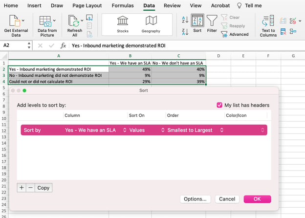
The resulting graph would look like this:
9. Title your graph.
Now comes the fun and easy part: naming your graph. By now, you might have already figured out how to do this. Here's a simple clarifier.
Right after making your chart, the title that appears will likely be "Chart Title," or something similar depending on the version of Excel you're using. To change this label, click on "Chart Title" to reveal a typing cursor. You can then freely customize your chart's title.
When you have a title you like, click Home on the top navigation bar, and use the font formatting options to give your title the emphasis it deserves. See these options and my final graph below:
10. Export your graph or chart.
Once your chart or graph is exactly the way you want it, you can save it as an image without screenshotting it in the spreadsheet. This method will give you a clean image of your chart that can be inserted into a PowerPoint presentation, Canva document, or any other visual template.
To save your Excel graph as a photo, right-click on the graph and select Save as Picture.
In the dialogue box, name the photo of your graph, choose where to save it on your computer, and choose the file type you’d like to save it as. In this example, it’s saved as a JPEG to a desktop folder. Finally, click Save.
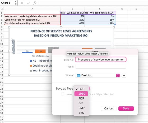
You’ll have a clear photo of your graph or chart that you can add to any visual design.
Visualize Data Like A Pro
That was pretty easy, right? With this step-by-step tutorial, you’ll be able to quickly create charts and graphs that visualize the most complicated data. Try using this same tutorial with different graph types like a pie chart or line graph to see what format tells the story of your data best.
Editor's note: This post was originally published in June 2018 and has been updated for comprehensiveness.
from Marketing https://ift.tt/2RPibfW
via IFTTT


.png)

.png)

0 Comments